3D for e-commerce5 min read
Fabrics and materials in a 3D product configurator
PBR maps, scanning a real fabric and getting the colour to match the swatch: how fabric is made for a 3D configurator, with MELIMELI as an example.
By CharpstAR · 4 Oct 2023 · Updated 29 Sept 2026
Part of 3D models for e-commerce: the complete guide
If you sell upholstered furniture online, the fabric is the part you can least afford to get wrong. A customer who ordered a sofa they took for warm grey and received a cool grey will send it back.
A configurator with thirty fabrics is only useful if the thirtieth one on screen matches the swatch in the customer's hand, in colour and in texture. This post covers how that match is made. You can see fabrics change on a modular sofa in our sofa configurator. The glossary explains what a 3D product configurator is and how it differs from a viewer, and the rest of what a furniture configurator has to deal with, such as sizes, rules and prices, has its own post. What an e-commerce product configurator passes to the shop's cart and order system is in the glossary.
What a 3D material is made of
A 3D material is a stack of maps that tell the renderer how a surface reacts to light, and only one of them looks like a picture of the fabric. The standard is called physically based rendering, PBR for short. Web viewers and configurators use it, and so does anything built on glTF.
| Map | What it controls | Why it matters for fabric |
|---|---|---|
| Base colour | The underlying colour with lighting removed | The whole colour-match problem lives here |
| Roughness | How sharp or diffuse reflections are | Separates matte linen from a satiny weave |
| Normal | Fine surface direction, faked geometry | Gives the weave its relief without adding triangles |
| Metalness | Whether the surface is metal | Zero for textiles, relevant for hardware and legs |
| Ambient occlusion | Self-shadowing in crevices | Depth in a boucle or a heavy knit |
| Opacity | Transparency | Sheers, mesh, cane |
Build a material from a base colour image alone and it comes out flat and a bit plastic. With the full set of maps the same fabric looks like cloth.
Furniture
Lounge chair
Eight fabrics from one range.

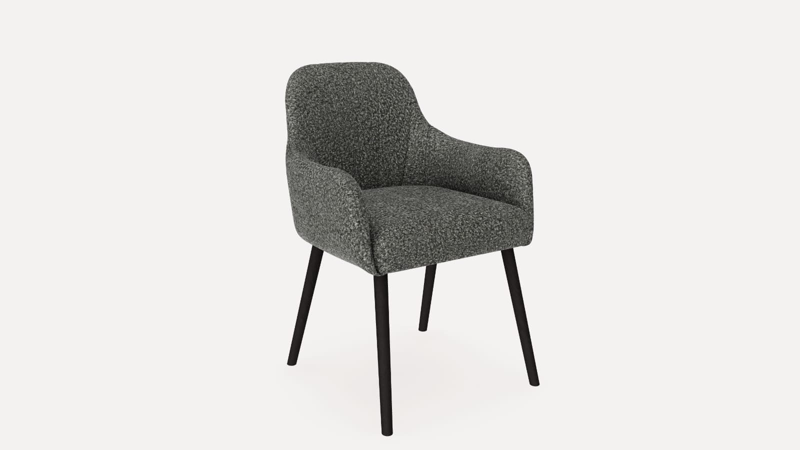
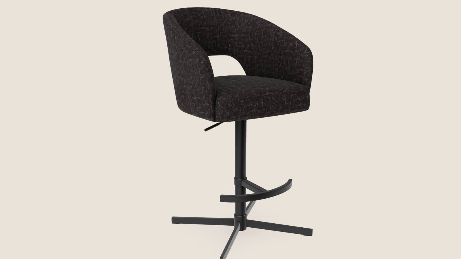
Eight fabrics from one range on one lounge chair. Change the fabric and go close to see the weave and how each one takes the light.
Getting the maps from a real fabric
The most accurate source is the physical swatch. It goes on a flatbed scanner at high resolution under controlled light, or into a scanner built for materials, and the scan records the weave and the colour as they are. The scan is then made tileable, so it can repeat across a whole sofa without a visible seam, and the separate maps are worked out from it. Of all the methods, this is the one that holds up when you put the screen next to the real swatch, and we use it whenever a client can post us samples. The sample page takes a product and a swatch.
A good photograph gets close, as long as it's flat, evenly lit and has a grey card in the frame for colour reference. A phone shot of a fabric in a showroom carries the showroom's light, and every map made from it inherits that error.
Simple materials can also be built from the spec. Given a plain woven cotton and a Pantone or NCS reference, a competent 3D artist can make the maps from the weave type. Boucle, velvet and anything else with a visible texture still needs a scan or a referenced photo.
The one to avoid is the supplier's marketing photo of the fabric used straight as a texture. It has the photo's light and shadow in it and it doesn't tile, so it looks wrong as soon as the model is lit any other way.
Texture scale on the model
Every fabric texture has a real-world size. A weave might repeat every three millimetres and a boucle loop every eight. Map the texture at the wrong scale and the sofa looks as if it's covered in canvas, or in a pattern too small to make out.
Getting it right takes the physical repeat of the material and the real dimensions of the model, so the model has to be accurate and to scale before anyone starts on materials. Stripes, large florals and other patterned fabrics need setting up on each model separately. The pattern has to run the right way and line up across the cushions the way it would when the sofa is upholstered in the workshop.
Where colour accuracy goes wrong
Most colour problems start at capture. If the source is a photo taken under unknown light, the colour is wrong before anyone opens a 3D tool, which is what the grey card is for.
Colour space is the next trap. Base colour maps are stored in sRGB and the other maps aren't. Mix that up and the fabric comes out washed out or oversaturated.
The viewer's lighting matters too. Light the model with a warm studio environment and every fabric renders warmer than its swatch. The product view needs a neutral environment, and the warmer, moodier lighting belongs in lifestyle renders.
Even with all that fixed, nobody can promise a perfect match, because the customer's screen isn't calibrated and you have no control over it. You can remove the errors that are in your hands and keep offering physical swatches for the final choice. In practice the configurator gets the customer down to two fabrics, and they order samples of those two.
Why materials cost less than photography as the range grows
A sofa in four sizes and thirty fabrics is 120 upholstered products to photograph, and each one has to be made before it can be photographed. In 3D it's four geometries and thirty material sets. Adding five fabrics next season means five material builds and no production run. A configurator that switches those thirty sets on one model is the colour and texture plan on our solutions page, and prices shows what that plan costs per product.
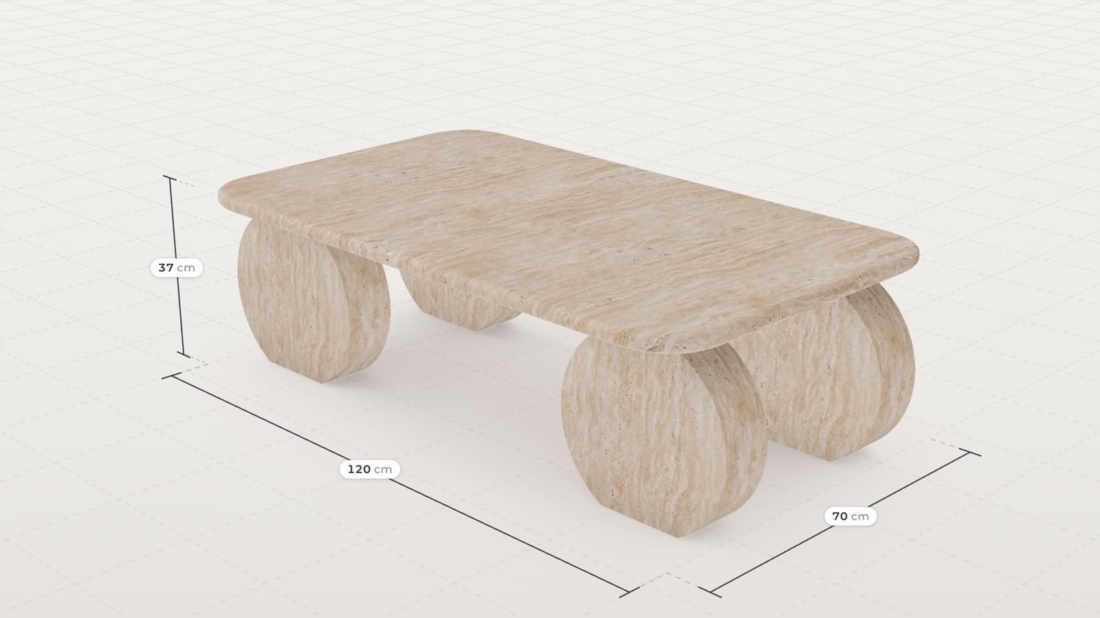
MELIMELI came to 3D partly because content for large furniture pieces was costly to produce, and their customers needed to understand each sofa across its fabrics. The same idea in stone, three materials shared by every part of one table, is in how a 3D product configurator is built.
What to ask a supplier for
- Materials built from scans, or colour-referenced photos, of your own swatches.
- Texture scale checked against a physical sample.
- The source material files, so the library stays with you if you change supplier.
- A neutral lighting environment for the product view.
- A plan for how patterned fabrics run and line up on each model.