Fashion4 min read
Sunglasses virtual try-on for fit, width and lens tint
How a sunglasses try-on estimates face width, renders the frame at true scale and draws the lens tint, and where to place it on the product page.
By CharpstAR · 4 Oct 2023 · Updated 7 Oct 2026
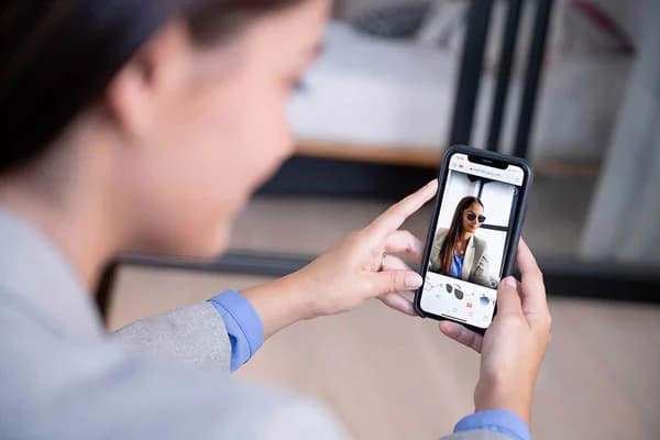
Virtual try-on works better for eyewear than for clothes or makeup: a frame is a rigid object with fixed dimensions, it sits on the part of the body that phones track best, and the shopper's questions about it are about shape and size more than colour. Below is how a sunglasses try-on is built, where it's exact and where it's approximate.

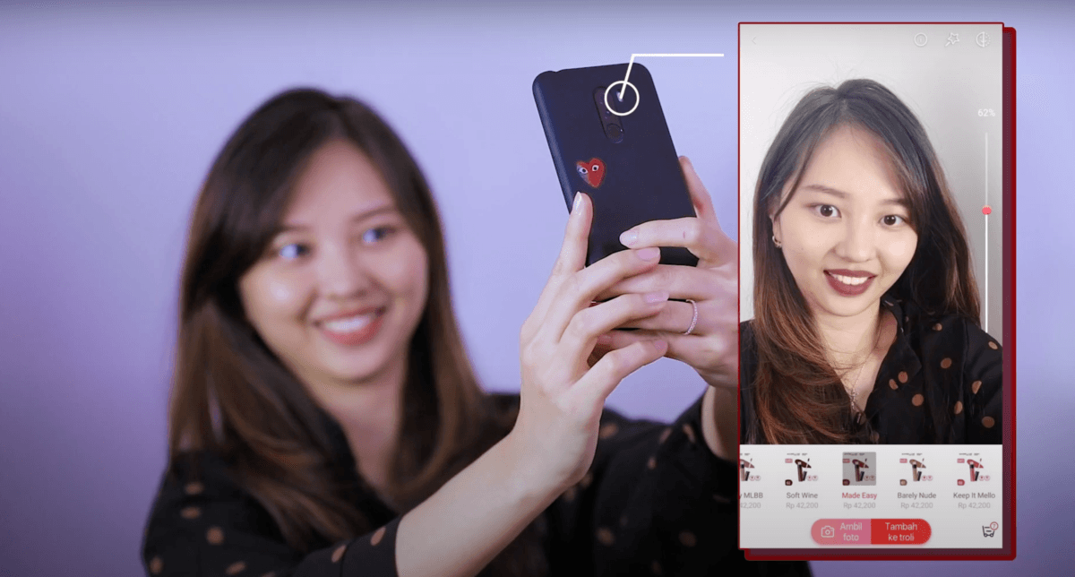
Choose a frame and a lens, then try the pair on with the camera.
Why shoppers hesitate to buy sunglasses online
Fittingbox's 2025 report, cited in Shopify's write-up on AR shopping, found that 54 percent of customers who weren't ready to buy glasses online wanted to check that the frames fit properly. The same source reports that 29 percent of glasses shoppers have used virtual try-on at least once.
Why face tracking works for eyewear
A frame has a fixed lens width, bridge width and temple length, so a 3D model of it is correct from every angle, which isn't true of a garment on a body.
Face landmark detection runs at full frame rate on a mid-range phone and holds through head rotation, so a rigid object can be placed at the bridge of the nose at the right scale and angle.
The shopper's questions are about geometry: whether the frame suits the face, whether it's too wide, whether the brow line sits right. The lighting and colour errors that make makeup try-on approximate don't affect them.
How the face width is estimated
An overlay that draws a frame on a face without knowing how big the face is can only tell the shopper about style. A scaled try-on estimates the face width from the tracked landmarks and the camera geometry, then renders the frame at its true dimensions relative to it. In a scaled try-on a 145 millimetre frame looks too wide on a narrow face, which is what the shopper needs to know.
Ask a vendor whether the frame is rendered at true scale and how the face width is estimated. Phones with depth sensors measure it directly, and other phones infer it from the distance between the pupils. The pupil method assumes an average pupil distance, so it's less exact. If the vendor can't say which they use, the try-on is probably an overlay with no scale in it.
Show the measurements next to the try-on. The numbers printed on a temple arm, lens width, bridge width and temple length, mean little to most shoppers on their own, and next to a scaled try-on they have context. If the shopper owns a pair that fits, a field where they type in those numbers is a cheap way to recommend a size.
Why lens tint is hard to render
Tint is what makes sunglasses harder than prescription frames. A tinted lens is partly transparent and changes what is seen through it. On the wearer's face it darkens the eyes behind it and reflects the environment off its front surface, and a mirrored or gradient lens does both unevenly across the lens.
Rendering that means compositing the tint over the tracked eye region with the correct transmission, adding a reflection that moves with the head, and handling gradients along the lens height. Implementations that skip the reflection produce a flat grey oval.
Mirrored and strongly coloured lenses are the hardest case, because the reflection carries most of the look and the environment being reflected is unknown. The usual answer is a plausible studio reflection in place of a real one, with a product photograph of the lens nearby so the shopper can see the true colour. As with any camera-based tool, the colour on screen gives an idea of the tint and isn't an exact match.
| Shopper question | How well try-on answers it |
|---|---|
| Does this shape suit my face? | Very well |
| Is this frame too wide or narrow for me? | Very well, if rendered at true scale |
| How does the brow line sit against my eyebrows? | Well |
| How dark is the tint? | Approximately |
| What is the exact lens colour? | Not reliably, use product photography |
| How does it feel on the nose after an hour? | Not at all |
Placing the try-on on the product page
The try-on belongs in the main image gallery, in the first or second slot. Below the buy button it gets little use.
Put it on every frame in the range. Shoppers notice whether a feature is on every product, and if it's on a few they stop looking for it.
The materials take most of the modelling work. Acetate has depth and internal colour variation, metal has anisotropic highlights, and a frame modelled with flat colours looks cheap next to the product photograph beside it.
A frame should load within a couple of seconds on mobile data, or shoppers leave before it appears.
People who don't grant camera access need a fallback: a rotatable 3D view of the frame with the three measurements and a comparison against a pair they already own.